Week 4: Publish Your Book Like A Professional
There are two kinds of self-publishing authors: those who slap it together themselves for cheap and throw it at an unsuspecting public and those who treat their book as professionally as a traditional publisher would. I stand with both feet firmly planted on the second strategy. I take this publishing step as seriously as I took the writing step. Otherwise, what was the point of working so hard on writing it?
When I made this leap into self-publishing, it wasn’t without serious consideration. What I came to understand was that “Why Kimba Saved The World” was never going to appeal to a mainstream publisher. I just had to face up to that fact. The real photos in the book (which some readers love and others don’t) made it different. I’d never published a book before, so that made me an unknown variable. Without an agent to bang down doors for me, I could spend years submitting and getting nowhere. Probably not even getting read. If I wanted “Kimba” to ever see the light of day, I was going to have to do it myself, but I had no idea where to start.
It was now mid-2012, and self-publishing had become the easiest and least expensive it had ever been. I don’t remember the exact train of events, but I had connections with publishing experience from my years of freelancing. Through conversations with other writers and former editors, I was hooked up with a “book guide.” This is an individual who has even more connections, knows how the self-publishing process works, and can walk you through and help you create a book. I had never met Carol Hohle, but I had rubbed shoulders with her husband during the time I worked in Boston doing research and compiling “Blessings of Forgiveness” for the Writings of Mary Baker Eddy. Her help guiding me through the process was invaluable.
Self-publishing is rather like building a house. I remember my sister griping about having to make a billion little decision on the house she built years ago. “I don’t care what kind of hinges are on the kitchen cabinets!” Creating a book is the same way. You need to be clear on exactly what you want the final product to look like and make lots of little decisions along the way.
What size will the book be? What size font are you going to use? Which font? How large are your margins going to be? What will the chapter beginnings look like? That’s not even touching on what the cover will look like. Don’t forget the text on the back of the book. Hugely important! Then there’s the whole process of getting the book set up on CreateSpace and KDP—just the business end of things. It can be overwhelming, but it has to be done right. A good book guide can walk you through the whole thing.
As we have evaluated the costs associated with the production of my first three books, we have already made some changes to move things in-house. That can save on cost, but I would only do this if I felt the end product would look as professional as it did in other hands. There were MANY discussions, and Scott and I didn’t always agree. There are some corners I refuse to cut, no matter how much he sighs.
Carol was heavily involved in both of my first two books, but by Book 3 I was ready to take on some of that on my own. Frankly, I had to. Formatting using InDesign is a time-consuming process, so it’s expensive to pay someone else to do it. Knowing that we are in this for the long haul, we decided to get a subscription for the whole Creative Cloud package (which also got us the invaluable AdobePro system). As a teacher, I can get it at a great price. I also use InDesign to create flyers and table toppers and ads, so it is a really useful program for the business of creating books and marketing them.
There is one point in the process I will never take in-house. You will hear it said from one end of self-publishing to the other, and I won’t be any different. DO NOT CREATE YOUR OWN BOOK COVERS!!! Unless you have serious cred as a graphic designer and artist, do not do it yourself. This is self-publishing suicide. Readers absolutely judge a book by its cover. It’s what attracts them and gets them to pick it up (click on it) instead of the million other books wafting by. I will pass up a freebie if the cover is for crap. And, sadly, I’ve done this more than a few times. To me, it sends a message that the inside will be for crap as well. That may not be true, but I’m a consumer, just like the rest.
I could write a whole blog on cover design, but that’s not my goal here. You can do your own search on that. My point, for my purposes in this series, is that we are not considering taking cover production in-house even though it is now the most expensive part of the production process for us. It is just too important to take a risk on. Scott is not always in agreement on this one. He really wants me to learn how to use all the programs I now have access to through Creative Cloud. For me, it’s not worth my time – also suspecting that I’ll just end up back with my cover designer to help me clean it up.
As I said, what I have started doing is formatting the text through InDesign on my own. This cuts $1,500 to $2,000 off the production costs. It takes weeks to do, and I messed up the book size on “Miss Fatty Cat’s Revenge” and had to go back through the whole thing. Lesson learned. For me, this was still worth it because the CFO across the hall was ready to put on the brakes on Book 3 for a while. I had to do whatever I could to keep that from happening.
There are lots of ways you can format a book. Word documents can be downloaded to amazon.com. Scrivener has its own system of ebook formatting. Writers I know sing this program’s praises to the moon. Be sure you check it out. I’ll be looking into that more myself in the future. I spend a few hundred dollars having someone create my ebooks, so that program might be helpful. Here’s where the books I am specifically creating are different than adult books or some kids books. I need genuine formatting.
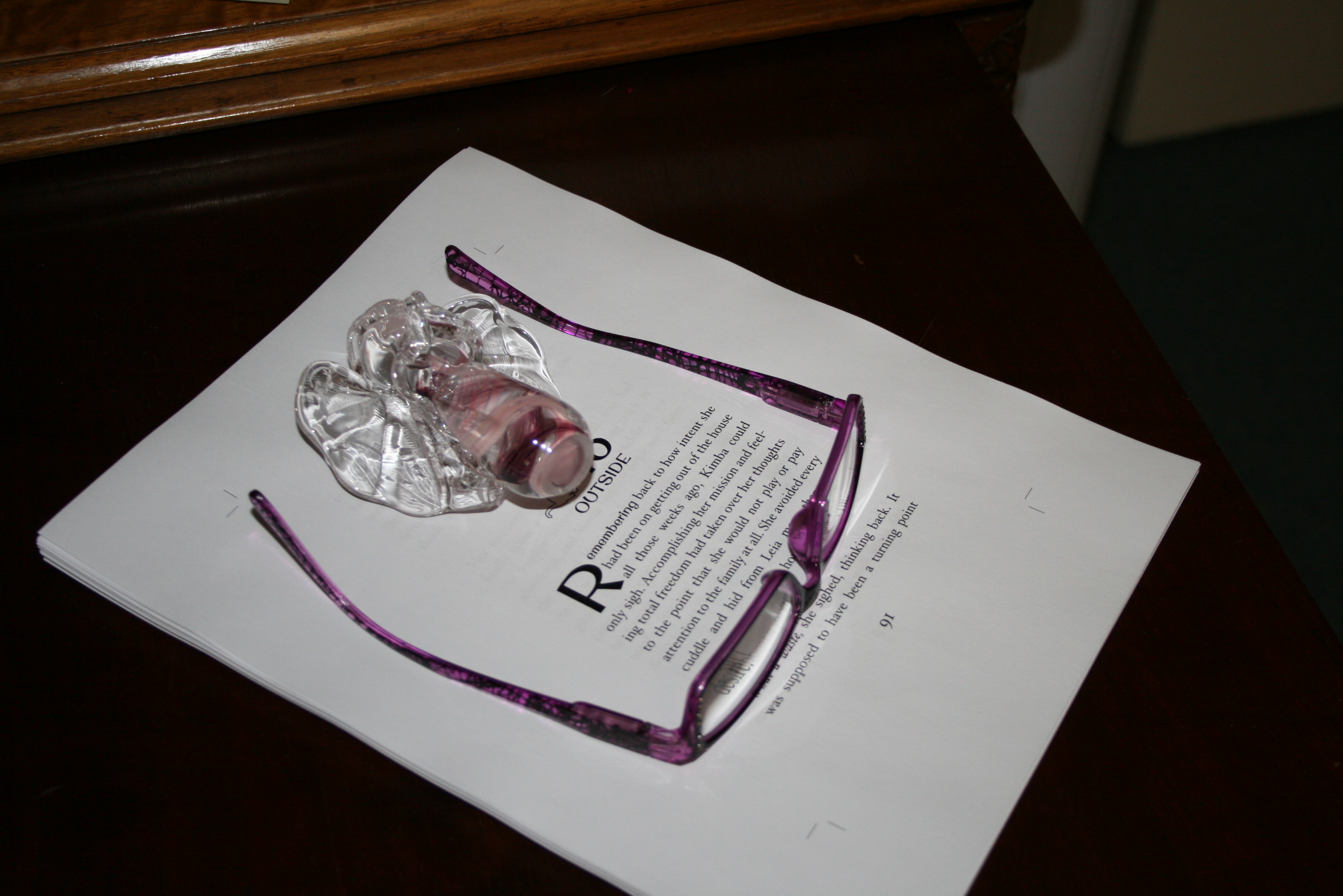
For my Cats in the Mirror books (and Max’s companion book, now in the works) I wanted specific fonts and have fancy chapter beginnings with an icon photo next to the number. There are photos inserted throughout. My books need to be genuinely formatted in a system that will make them look exactly how I want them to look. This was beyond important to me. I wanted to sit on the shelf next to a traditionally published book and look just the same, if not better. Do a “look inside” at amazon.com to see what I mean.
For example, when we first got the ball rolling, Carol asked me what books I thought my books were like. Which books did I want them to look like? After doing some research, I settled on the Humphrey the Hamster series. The cover was like what I had in mind—a real photo mixed with cartoon elements—and it was for the same reading level. That decision drove everything else from the size of the book to the font we used. It helped my cover designer know what style I was looking for.
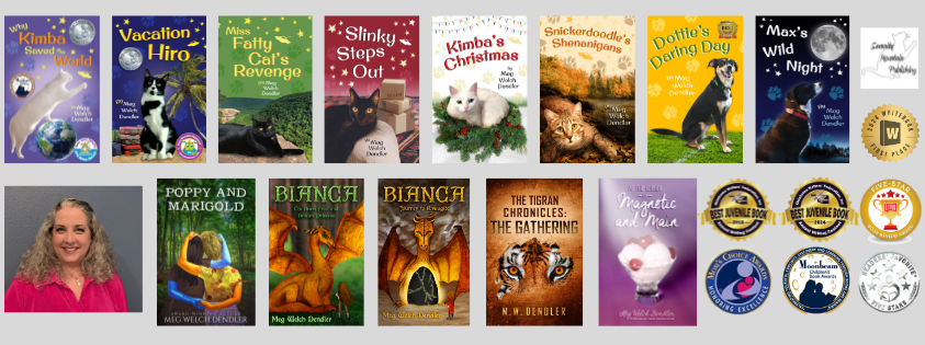
Lesley Hollinger Vernon worked on the cover for “Kimba” with Carol as our intermediary. I never talked directly with her. For “Vacation Hiro” we talked directly to save on time/money. For Book 3, Carol was not involved, but I still went right to Lesley. Developing that relationship and understanding of the style of a series is HUGE! Book 1 went through several stages of cover design and changes to background color and animation. Book 2 had a few changes from the first proof to the final. Book 3 was almost perfect from the first draft. We just tweaked it a bit for color and minor details. We have developed a style for the series, and it never occurred to me to go with anyone but Lesley for Max’s book this spring. Finding that person for your cover design is huge. Don’t skimp on it. I absolutely know that I have sold paperback books, often all three as a set, without the books even being opened. I can talk about the plot, but the covers sealed the deal and sold them. That’s what you need!!
So, in our final analysis, going with a book guide was right for us. Carol saved me tons of headaches and redos, especially in dealing with CreateSpace. But as we have learned and progressed, we were able to take on everything she was doing for us. You may be happy to leave all of that in someone else’s hands. That’s okay too. For us, it was really financial. Carol was worth the money, we just didn’t have it to spend. And, I have to admit, I enjoy doing the formatting myself. I am a proudly professed control freak. I love making little final tweaks to the text as I move it from Word to InDesign. I’ve even changed words so they fit on the page better (never hyphenating words is a decision we made on Book 1). I can end up with everything exactly how I want it. That’s a move I’m glad we made.
Over the next year, I’d really love to learn more about the ebook formatting process and making changes to what is already done. I love the ones I have, and it’s not terribly expensive, but making updates when a new book comes out can add up. It’s also somewhere that design is not really an issue. I’ve already done that. There’s just technology to be learned. I doubt I will have the time to do that before “Max’s Wild Night” is ready to go, but I’ll be poking at it to update the Cats in the Mirror books with links to the new book. Maybe I can figure it out!
There are a hundred ways you can produce your book (ebook or paperback or hardcover). Plot it all out well. Consider everything along the way. Again, are you hoping to make money from this process? You are going to have to take it all as seriously and professionally as a traditional publisher would. You are establishing your reputation as writer and as a self-publisher. Give it 100%.
Do you have a book guide or a cover designer you would recommend?
Next Week: Where to Publish


